— OOM DATA
When the CEO of TVD realised that his 25-year-old brand was outdated and no longer communicated its competitive advantage, he came to Oystercatchers NZ for a rename. rebrand and refresh. We worked on the new company name and brand identity and then visually linked the technology solutions with the parent brand. We then wrote the website and brochure copy and provided and app design guidelines for their internal team. OOM Data is an easy to use, cost-saving Outage and Operations Management software system. It simplifies the handling of outage communications and provides works management solutions for utilities, trusted globally.

Brand hierarchy wth OOM DATA and products Avalanche and Katana underneath.
— THE APPROACH
Insights
The company had built up specialist expertise in outage management for power companies. This was their competitive advantage and the opportunity was to own this space globally.
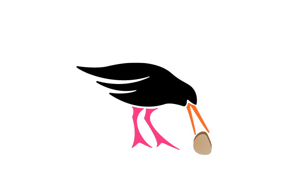
The product ‘Avalanche’, named because of the influx of calls received during an outage, was clearly the hero product. This name and red colour had recognition.

Strategy
In an industry full of acronyms the name ‘OOM’ was memorable. Simple, it calls out the client’s competitive advantage asOOM = Outage and Operations Management. The .com domain was available, allowing for simple deployment across global markets.
Rather than reinvent ‘Avalanche’ and ‘Katana’ their names and colours were retained.

Design
The OOM DATA visual identity represents both the network of information and energy combined, The colours are drawn from the reds and yellows of its product offering - a warm orange.
The style is deliberately simple and clean representing simplicity of the product’s use. The design challenge was to create visual cohesiveness across all materials
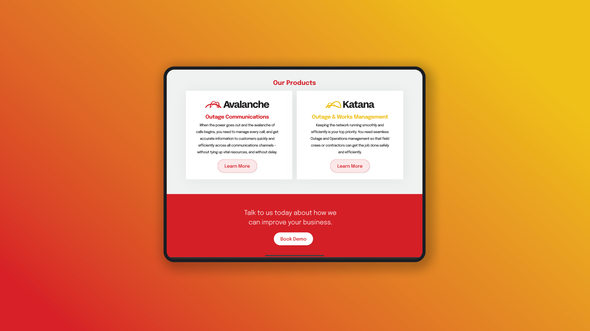
Avalanche and Katana - a cohesive look across the website.

Style Guidelines were prepared for the Outage Reporter APP developer.

Avalanche Module - Outage Reporter.

Typography was detailed for all digital material.